


WebSim

WebSim is a platform for creative expression on the internet. A prompt becomes a website. The website becomes raw material. What comes back is yours to edit, to remix, to hand into a community that treats every creation as a starting point. A model can produce a website in seconds. What it cannot do is decide what should happen before, beside, and after that moment. A creative tool is defined by the conditions it sets: where to grant freedom, where to introduce friction and when to dissolve the between them.
My contributions
Design
Development
Evals
The team
Max Bittker
Sean Lee
Cameron Franz
System Prompt Engineering
The system prompt is the single piece of text every generation on the platform passes through. One line changed there is a redeploy across multiple models at once. The same change can be very good for one model and quietly worse for another, and reading the prompt tells you nothing about which.
Before changing anything in production, I built a way to observe changes to the system prompt. The tool runs a test prompt against every model in parallel, against both the local and production versions, and renders the outputs side by side at desktop and mobile viewports. Every prompt change after that became something I could measure, observe and evaluate.
Click here to view the interactive page.
Two findings came out of the work the tool made possible.
Models do not respond the same way to identical instructions. Claude reads stylistic direction conceptually. A principle like avoid purple backgrounds and garish gradients lands well and changes behaviour across adjacent cases. GPT-5 leans more on pattern matching. The same idea works better as example-driven guidance: match the visual language to the prompt and use colour purposefully. The intent is identical but the rhetoric is different. I split the shared block into two paths, and output on each model improved once each was being addressed in the language it responded to.
The instinct on mobile was wrong. When mobile generations look bad, the impulse is to add more layout rules to the prompt. Across four numbered experiments, the opposite proved true: the prompt got shorter and the output got better. The shipped version sits on five principles instead of paragraphs of instructions. One screen height. Start immediately. Progressive disclosure. Touch-friendly hit areas. No titles or instructions unless asked for. The same prompt now runs on every generation, including the ones happening on desktop. A constraint discovered for one surface became the design philosophy the whole product inherits.
old
“The user is on mobile! Be sure what you make is mobile-friendly. I repeat, the user is on a phone or an ipad or tablet!”
new
“The user is viewing on mobile! Design for optimal mobile experience:”
- —You're designing for a mobile viewport in an iframe — this is the entire experience.
- —One screen height, no scrolling unless asked.
- —Start immediately — no 'tap to start' buttons.
- —For complex interfaces, use progressive disclosure with animated transitions.
- —Touch-friendly: 44 × 44px minimum hit areas.
- —Maximize space — no titles or instructions unless explicitly asked.
The mobile prompt before and after four experiments.
1
reverted
Removed pattern-suggestion section (modals, accordions, sheets).
Output got measurably worse. Rolled back — the patterns help even when the model knows them.
2
kept
Simplified navigation guidance — dropped specific numbers and parenthetical qualifiers.
Quality stayed the same, the prompt used fewer tokens. The simpler version stayed in.
3
partial
Forbade chrome on mobile output — no page titles, no "tap to start" instructions.
GPT-5 obeyed. GPT-5 Mini did not. Smaller models in the same family need stronger prompting.
4
universal
Replaced the verbose mobile prompt with five short principles, applied universally.
Better output on every model. The mobile philosophy now runs on every generation, including desktop.
Four sequential experiments on the mobile prompt. Each one made a single change against the eval set.
Asset Panel & Creative Tools
A pattern I noticed on the platform was that the most engaged users were not the ones generating the most projects. They were the ones spending the most time on a single project after the first generation. They painted over the model's image. Swapped in a file of their own. Recorded a sound effect. The generation got them started but editing it was where the project began to feel like theirs.
This pattern carries an economic weight that is easy to miss. A generation costs roughly two thousand tokens. An edit on an asset costs roughly thirty. The user attaching themselves to a project and the platform spending less money happen in the same gesture. The design problem was making that gesture easier than the alternative. Making something that is theirs rather than making many things.
token cost
Affinity to project
Generation and edit costs sit roughly two orders of magnitude apart.
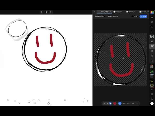
The existing panel made personalisation harder than it should have been. It was a popover that hid most of itself when open and disappeared when the user clicked outside it. Upload was buried inside a dropdown. The tools that belonged next to the assets — image editing, background removal, audio recording — lived in scattered dialogs across the product, or did not exist yet.
I redesigned the panel and shipped the full system across two weeks. The popover became a full-height sidebar that opens alongside the project. Upload became the first item rather than something to dig for. Image editing moved inline with the asset. Edit-with-AI, background removal, and audio recording were built in.
Two kinds of tools live in the panel now. Direct manipulation handles the cheap edits. AI handles the changes that need a model call. Both write into the same project state, so the user can move between them without leaving the panel.
Live iframe preview while drawing on asset on the right.
One small detail mattered more than it looked like it would. Token counts on code files, sitting next to the filename. The number is easy to ignore. It changes how users decide what to keep in a project, because the cost of the context window is now legible before a generation rather than after.

Mobile Experience
For a long time, the mobile experience on WebSim was a desktop layout rendered into a phone viewport. Responsive CSS handled most of it, but not all of it. Keyboards behave differently on iOS and Android in ways that breakpoints cannot fix. iOS overlays the keyboard on top of the page instead of resizing it. And the expectation on a phone is that the input is the main thing on the screen, not one element among many.
The fix was to stop trying to make mobile look like desktop and start treating it as its own surface. Its own layout components. Its own platform-detection logic. Its own creation flow, where the prompt input is the centre of the screen and everything else moves around it.
Mobile native project creation experience.
The work landed in three pieces. A vertical, swipeable feed where each project takes the full viewport and the next is a thumb-flick away. A creation flow with an expandable URL bar, a compact prompt input that adapts to keyboard state, and animated suggestions in the empty state. And the removal of the top navigation bar in the feed for logged-in users, so the project itself fills the device edge to edge.
The mobile feed in motion
The platform side eventually closed a loop with the prompt side. Once the layout was treating mobile as its own surface, the system prompt could be confident about how a mobile generation should behave. Both now operate from the same design philosophy: one screen height, an immediate start, touch-friendly elements throughout. The user sees a coherent product rather than a generated layout fighting the chrome around it.
Platform UI
WebSim's interface had accumulated eighteen months of features added one at a time, and it showed. Popovers opened without a clear way to close. Settings the user had configured did not persist across reloads. The sidebar reset to its default width every time the page loaded, even though the new width was being saved correctly, the bug lived in the initialisation code, not the persistence layer. None of it stopped a user. Together it made the platform feel clunky.
The work in this area was modernisation rather than redesign. Familiar UI patterns from the rest of the modern web, applied uniformly. Radix popovers. Persistent sidebar widths. Hierarchical project detail cards. A redesigned right navbar. Sane popovers for shards and the wallet. Empty profile states that explained themselves. A two-per-day cap on notifications so the feed did not become noise.

Homepage before and after.

There was a long tail of around thirty smaller pull requests. Spacing fixes. Z-index ordering. Login modals. Light-mode variants. Comment drawer styling. The post button placement on mobile. The mention menu layering above the card stack. None of them interesting on their own. Together they are most of the actual day-to-day work on a maturing product, and most of what users mean when they say a platform feels well made.
Websims Christmas Event
The last project of the year was the Christmas event. Snowfall on the homepage. A swirl that ran across the page. A seasonal treatment in the chat input. The same care that went into the popovers and the sidebar widths went into a surface that runs for three weeks at the end of the year.
At the centre of it was a 3D Christmas tree the community decorated together. Users submitted ornaments as assets through the comments. The ones with the most upvotes were displayed on the tree, and the top-voted ornament became the star. A small feature that turned the season into a reason to gather, and the comment thread into something the whole community could see itself in.

Websim Christmas event and Tree.
The surface area for creativity with AI
The pattern across these pieces of work is that the most leveraged decisions on a generative platform tend to sit on either side of the generation step rather than inside it. The system prompt decides what every model produces by default. The asset panel decides what a user can do with the result. The mobile surface decides what they see first. The platform UI is what holds all of it together as a single product rather than a collection of features.
Working on WebSim taught me something about building creative tools, and about what it means to build software that helps people express things they could not before. Toolmaking turns out to be a discipline of knowing when to be opinionated and when to get out of the way. When to set a constraint and when to remove one. When to make a decision for the user and when to leave them the room to surprise you.
The model is the engine. Everything around it is the car: how it handles, what the driver can see, where it can take them. The job of a toolmaker is to build a vehicle for someone else's creativity, and to leave the road open enough that they can find a journey they did not know was possible.

